Temperature
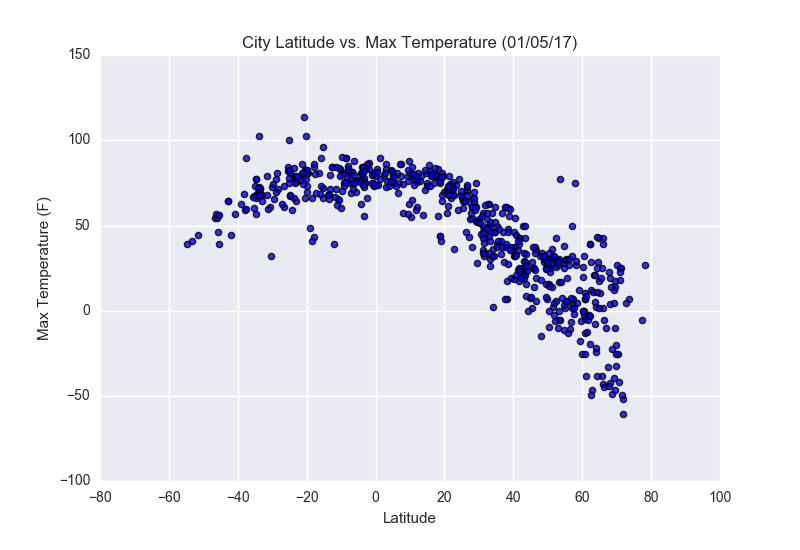
This plot was created from a project that analyzed weather in proximity to the equator by latitude. The data was pulled from the OpenWeatherMap API from the data of 520 cities. The plot above shows a scatterplot of Latitude vs. Temperature. We can see from the plot the higher a city is in latitude the lower their max temperature is. We can also see most cities around 10 in latitude are also clustered the closest together around 70 °.
Visualizations